We have a logo.

The blue font is both a tribute of sorts to the Neil Squire Society aqua colour and represents the utility of the LipSync. The logo also represents stability, capturing the essence of the LipSync.

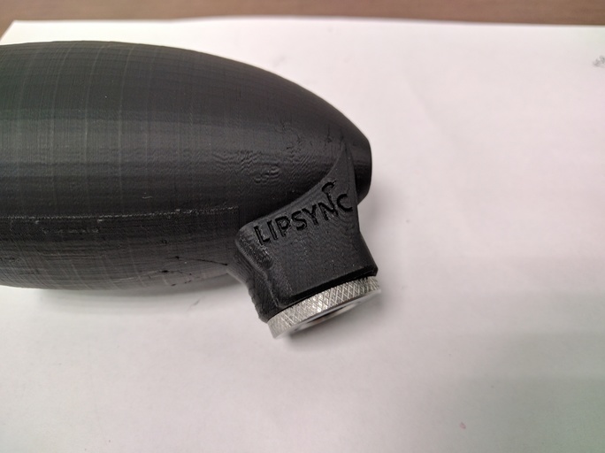
The new logo printed on one of our recent prints of the LipSync head.
Initially, our team brainstormed logo ideas, contemplating every detail. (For example: Should the LipSync be in the logo? Should the emphasis be on a graphic or the font?) How we brand the LipSync will be important to how we can attract makers and users alike, and the logo is really where that starts.
From there, nine designs were created as potential logos. The team voted on the nine to determine which one would represent the LipSync. While all had merits, the one you’re viewing here won by a clear majority.
The credit for the design goes to one of our two “new” interns, Kristina.

Industrial design interns Brandon and Kristina.
Brandon and Kristina joined our team as industrial design interns in September. They both are graduates of Emily Carr University of Art and Design (new window), adding to the list of diverse BC post-secondary institutions that our team draws from. They are working on both the branding efforts, and helping our engineers continue to design not only a usable LipSync, but an aesthetically pleasing LipSync. (Users will theoretically be carrying this everywhere they go — a user has to want to be seen in public with one.)
They have been wonderful additions to the team and have brought with them a wide range of fresh ideas and a new perspective.
